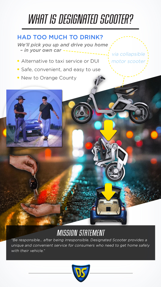
I always enjoy projects involving branding, especially when given the opportunity to develop a product or creative direction from the ground up. This was the case in my winter 2013 MBA course Marketing on the Internet. The project allowed my team and I to propose a new business, and develop an online/mobile marketing plan around it. We chose to propose bringing to Orange County a scooter pickup service that would get both inebriated bar-goers and their automobiles back home safely – a service we decided to call Designated Scooter.
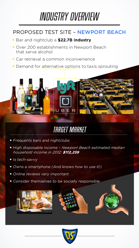
This service would dispatch a driver on a collapsable electric scooter to your destination. Upon arrival, this driver would fold the scooter into your trunk, and drive you to your residence, before going on his or her way to the next pickup. Variations of such services already exist in other countries and regions of the US, and obviously functioned within limited ranges. Our version would begin with New Port Beach, one of the most active and concentrated destinations for drinkers and nightlife seekers in the area, less than 10 miles away from the UCI campus.
As mentioned, we realized similar services existed elsewhere, but we wanted to be sure ours could stand out from the competition, both direct and indirect (ranging from taxis and rickshaws, to substitutes such as calling friends). Clearly defining our value proposition would undoubtedly be crucial. However, we realized that we would have to go beyond that to really resonate with users, and much of that would be dependent on our branding.
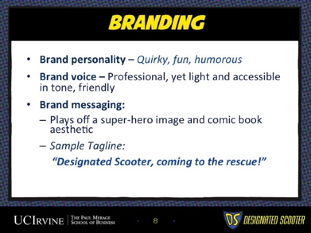
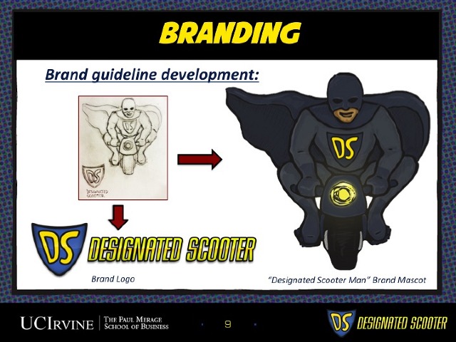
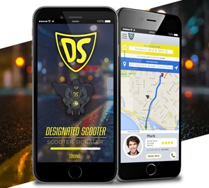
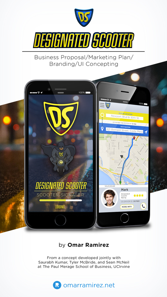
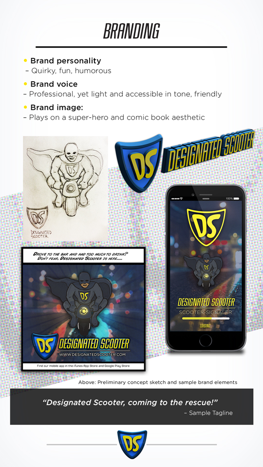
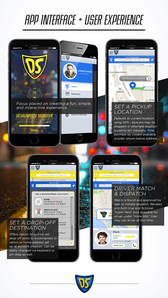
I took the lead on developing the brand persona, and its implications for the design and execution of the overall business. From the start we knew we wanted to go in a fun, somewhat humorous, tongue-in-cheek direction, while remaining rooted in professionalism, dependability, and safety. This evolved into a discussion of superheroes, and images of superheroes on scooters. I ran with this, starting with a write-up, and went on into the execution starting with a quick sketch. I then cleaned it up, colorized it, and mocked up an ad, to help better communicate the overall vision for the brand, before proceeding to mock up a screen for the app (shown at the top). Here you can see how the sketch evolved into the branding for the service:
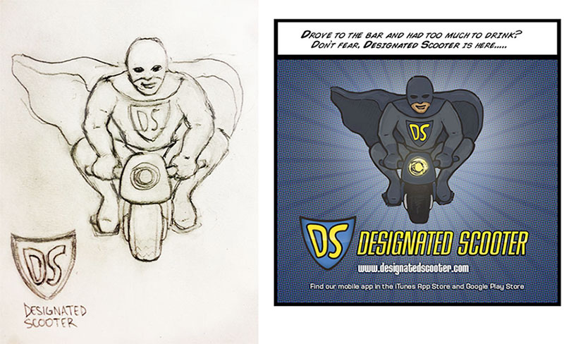
These, while very preliminary, provided a pretty good picture of the creative direction I had in mind for our brand. My groupmates and I envisioned this carrying over into real world, through brand mascot promotional appearances, branding on employee uniforms and scooters, on swag, etc.
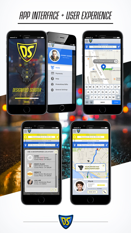
As we developed our idea, we also realized our proposed app would central to the service, to our ability to connect with consumers, and to our overall marketing strategy. Though we weren’t necessarily tasked with going into the specifics of app design and functionality, I felt having at least a basic wireframe would help make our vision for the service more concrete and understandable. Here is what I created:
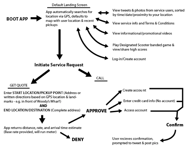
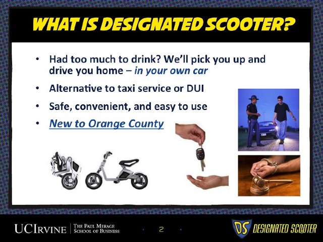
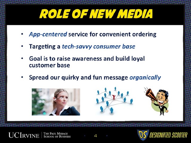
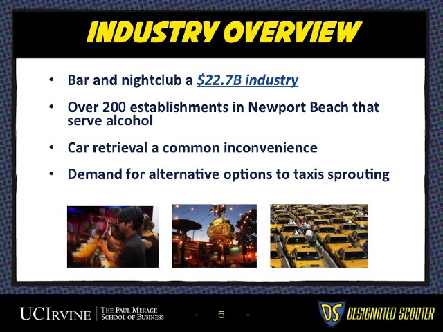
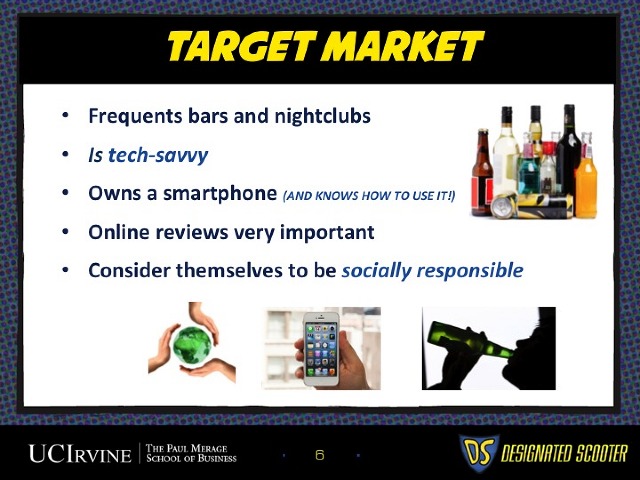
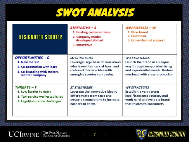
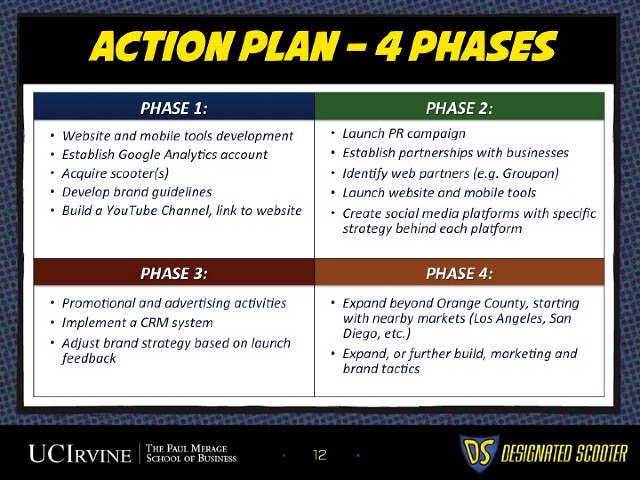
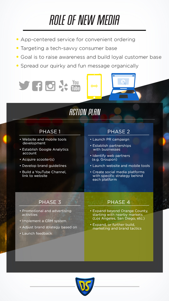
Now, brand and app design were not the focus of the class, but I felt they were important to the project, and the professor definitely appreciated getting a more tangible idea of our intended execution. The following is a short simple deck (mainly talking points) I put together when it came time to briefly present the background of the project, and our overall strategy for both getting it off the ground and tracking performance:
